Redesigning Singapore’s favourite tofu

The Challenge
How do we modify traditional thinking, and refresh an existing image that’s already a big part of consumer buying habits? How do we modernize familiar packaging and keep vital information intact? These are the questions that surfaced when Mojo Red started the challenge of redesigning Unicurd's new tofu packaging.
Unicurd Tofu: a market leader in packed pasteurized silken tofu
Founded In 1980, Unicurd began producing hygienically-packed tofu in a factory in Singapore. Unicurd introduced to Singapore the first hygienically-packed pasteurized silken tofu, in hygienically-sealed boxes and in tubes. The product was an instant success.
- source unicurd.com.sg
Magnifying The Brand
When Unicurd Tofu entrusted Mojo Red with this project, they were not just asking for a refreshed design; they were instead giving us the great responsibility of recreating the image of a product that has intimate and familiar attachment to homemakers in Singapore.
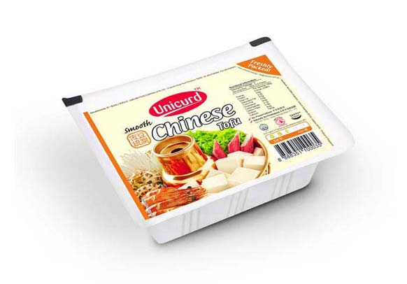
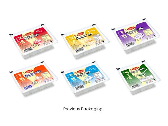
This visual and functional improvement involved months of work during which illustrators, designers, photographer (Tommy Chia) and the marketing team were involved in taking an important step to a new visual stage of the packaging. Analyzing the bonds among each and every element of the packaging, Mojo Red took the huge leap to remove the traditional illustration in the old packaging and replaced it with a clear and aesthetically pleasing photo of the dish — to generate a more unified and competitive visual system that stands out on a shelf.
With the improved layout of text and vital information, the consumers can now see more of the contents of the package — an important improvement which makes the product stand out. The logo is also magnified, highlighting the brand further in connection with the product.
The result is a new packaging that exceeded expectations at its launch, allowing the product to take centre-stage and preserving the tradition and familiarity of the brand while injecting a modern twist.



 Do you have an assignment you'd like to discuss with us? Coffee is on us! Feel free to email us or use the web form and we can take your project further from there. Click here to go back to the top.
