Our Other Case Studies
 Unicurd Tofu Packaging
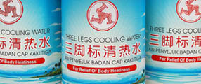 Refreshed Three Legs Cooling Water
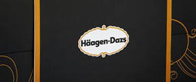 Haagan Daz Packaging
 Golden Peony Rice Packaging Redesigned
 Ji Xiang Canned Foods Redesigned
 Hai's Heritage Premium Boxes
 Bollybites Instant Meal
 Mandrake Medical Branding
 My Farm UHT Milk
 VITA Rice Packaging
 Win Win Festive Packs
 Saucisse The House of Gourmet
 Spicing Up Amir's Frozen Meat Label
 igen mints Packaging Design
 Mini Pocket Korean Party Pack
 H-TWO-O Black Currant Sparkling Thirst Quencher
 Hai's Spice Up Your Bite
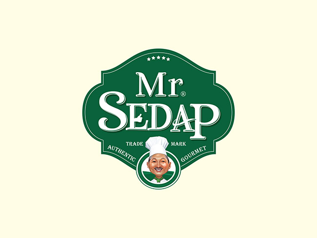
Mojo Red Adds "Sedap" Into A New Brand
Task: Packaging Design, Creative Direction, Brand Design
Creating A New Brand
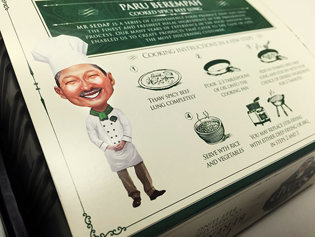
Mr Sedap was created to serve quality halal food, targeting Malay consumers who live busy lives and need convenience for their daily food options. This packaging is a mix of the Malay culture and also elements of colonial Singapore. Keeping the base colour of the packaging neutral in order to use bold food photography and various symbols to differentiate between flavours. Every element used in this packaging was strategically designed and placed for the best possible outcome.
Unifying strong colors within the packaging sysyem, it creates a "billboard" effect when placed on the shelves, introducing a fresh, playful and light-hearted touch to the retail environment. The main goal which our agency achieved during the work was – to separate this brand from the competitors on such an overpopulated market and to bring the main value of it.
Simply Sedap!
To support the brand's core essence of authentic Singaporean gourmet and it's popular Malay chef, we illustrated him as the brand mascot to communicate that Mr Sedap products delivers the best in taste and ingredients. As a final design element, a vertical banner system was employed to stage the logo, product names and description, allowing a quick and easy read no matter the different type of meat.
Mojo Red Art Director, Derrick Lin says “We put the cheerful Malay chef illustration at the heart of the pack and we had fun with the back of pack, too, using Singlish to capture the essence of a multi-cultural heritage in Singapore."


 Do you have an assignment you'd like to discuss with us? Coffee is on us! Feel free to email us or use the web form and we can take your project further from there. Click here to go back to the top.