Our Other Case Studies
 Unicurd Tofu Packaging
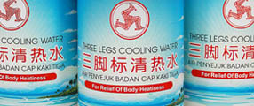 Refreshed Three Legs Cooling Water
 Haagan Daz Packaging
 Hai's Heritage Premium Boxes
 Ji Xiang Canned Foods Redesigned
 Bollybites Instant Meal
 Mr Sedap
 Mandrake Medical Branding
 My Farm UHT Milk
 VITA Rice Packaging
 Win Win Festive Packs
 Saucisse The House of Gourmet
 Spicing Up Amir's Frozen Meat Label
 igen mints Packaging Design
 Mini Pocket Korean Party Pack
 H-TWO-O Black Currant Sparkling Thirst Quencher
 Hai's Spice Up Your Bite
Evolving with a classic brand

The Challenge
With a myriad rice brands emerging in the local market, Golden Peony was convinced of the need to refresh the Golden Peony brand and to further drive brand and category growth. The challenge was to revamp its image without losing the product's traditional perception and other positive attributes such as family heritage, quality and reliability.
Golden Peony: A Reliable Mainstream Brand
Golden Peony is the mainstream rice brand for Topseller and is a long standing, reliable rice brand with more than 20 years of history in the local market. Throughout the years, it has earned itself many loyal customers in the mainstream rice category and is a mainstay in many households.
Matured Brand Revived
We knew from the beginning that this would be a significant undertaking. Golden Peony needed more than a packaging update; we needed to highlight the brand attributes through the logo and graphic elements as well. We started by re-illustrating the Golden Peony logo: simplifying, magnifying and modernizing it in a way that highlighted the brand and the name in an engaging way.
An iconic brand like Golden Peony needs to constantly transmit evolution — so all elements of the packaging, from typography to structure, needed to be refreshed to keep up with the brand’s evolution. Text layout, vital information and colours were also modified to allow consumers to understand and recognize the brand while subconsciously consuming information about the brand message.
The result was packaging design that blended style with tradition, and aesthetic with functionality — and a brand image that is a pleasure to behold.

![]()


 Do you have an assignment you'd like to discuss with us? Coffee is on us! Feel free to email us or use the web form and we can take your project further from there. Click here to go back to the top.