Our Other Case Studies
 Unicurd Tofu Packaging
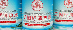 Refreshed Three Legs Cooling Water
 Haagan Daz Packaging
 Golden Peony Rice Packaging Redesigned
 Hai's Heritage Premium Boxes
 Bollybites Instant Meal
 Mr Sedap
 Ji Xiang Canned Foods Redesigned
 Mandrake Medical Branding
 My Farm UHT Milk
 VITA Rice Packaging
 Win Win Festive Packs
 Saucisse The House of Gourmet
 igen mints Packaging Design
 Mini Pocket Korean Party Pack
 H-TWO-O Black Currant Sparkling Thirst Quencher
 Hai's Spice Up Your Bite
Fusing premium quality with freshness

The Challenge
Amir's, one of the house brands of Singapore Food Industries, has enjoyed a reputation for quality of a wide selection of meat cuts. To keep from being lost in a sea of look-alikes, Amir's needed to create a cohesive brand identity that stands out among the crowd, being consistent enough to solidify the brand but flexible enough to highlight product differences and new additions to the brand.
Singapore Food Industries: A National Favourite
Since its incorporation in 1973, Singapore Food Industries has become the largest integrated food company in Singapore, with a wide portfolio of food products and services. With more than thirty years in Singapore, SFI has grown in size, diversification and market reach. - source sfi.com.sg
Solidifying The Brand
Mojo Red began by identifying elements to portray a sense of freshness, and reflect the premium nature of the brand. Using graphics and colors, and armed with a sound knowledge of consumer psychology, our team stylized the packaging to reinforce the brand image. Cooking preferences icons were carefully illustrared, making it easy for customers to choose which meat to purchase according to their preferred cooking styles. The packaging also engaged customers by explaining, at the back of the package, the reason for which frozen meat appears a darker colour. This dispels customer worries about frozen meat.
The result was an attractive, eye-catching packaging design that engages customer interaction with the product while reflecting the customer-centric brand image.


 Do you have an assignment you'd like to discuss with us? Coffee is on us! Feel free to email us or use the web form and we can take your project further from there. Click here to go back to the top.